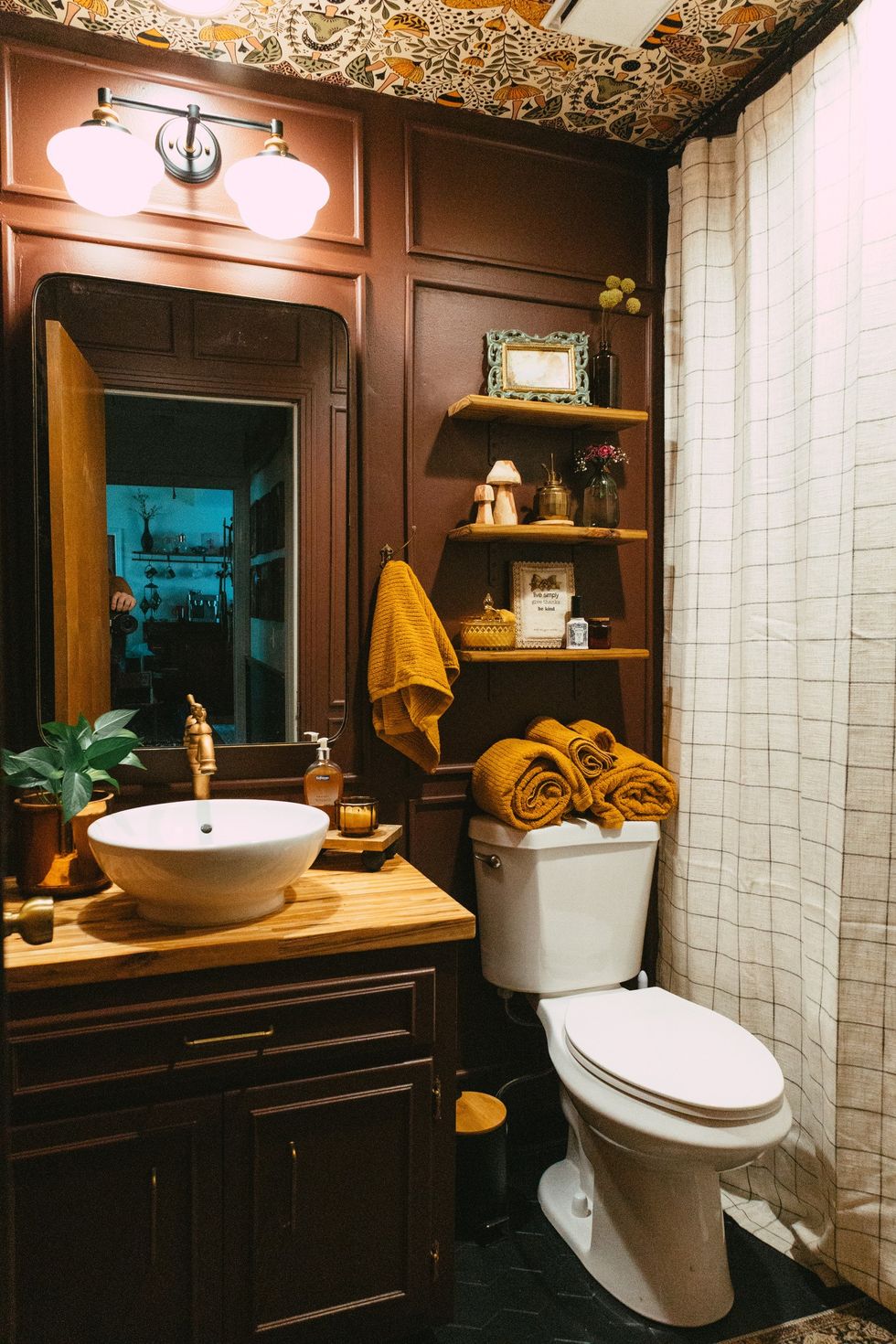
Bold, monochromatic rooms are trending this year and odds are, if you scroll social media as much as I do, you’ve seen home transformations where paint is the main event. I’m talking paint on the walls, paint on the ceiling, the trim, the doors — everywhere.
The result is a luxurious, high-end feel that punches a pack to the senses in the best possible way. But how can you get the same luxe effect in your everyday DIY projects? Let me show you.
Inspiration & Influence 😍
Julia Marcum from @chrislovesjulia does this so well. In fact, her primary bedroom makeover was the original inspiration for our guest bathroom DIY project. Seeing her do such a moody color in a lower-light room gave me hope for my windowless, tiny guest bathroom. But I knew it wouldn’t be as simple as slapping on some paint. To make this work, I’d have to break all the design rules I had ingrained into my brain.
@homebodyhq WALLPAPERING THE CEILING stay tuned friends #bathroomdecor #guestbathmakeover #smallbathroomdesign #wallpaperceiling #ceilingwallpaper
I found the most perfect wallpaper, which featured a mystifying burgundy, outlined with bees and mushrooms throughout. This color was exactly what I was looking for, however, the folks on TikTok were not impressed.
I was talked out of this stunningly dark, chocolatey-red color and opted for a faded version of the shame shade. As I painted it on, I hated it. My vision for the space was much more elevated and moody — almost like a sexy boutique hotel bathroom, full of so much personality, you forget how small the space actually is…

This faded shade was giving preschool bathroom.
So against the better judgment of the very qualified viewers of TikTok ;), I painted over it with Benjamin Moore’s Townsend Harbor Brown.
@homebodyhq Replying to @dwrldgster but I like it 👏🏼 #unpopularopinioncheck #uniquebathroom #brownbathroom #bathroompaint
I affectionately call it “red velvet cake” because it’s rich and delicious. In some light, it’s a brown but with remarkable depth, and in other light, it’s a bold red lipstick shade worn by your favorite Hollywood icon.
The followers were too stunned to speak. Everyone flooded my comments section with overwhelming love and adoration for a 5-by-7 room decked out with mushrooms and golden accents.
Still Nervous To Double Down On Dark Paint? 🫣
I totally understand the hesitation to go for such a bold color. We were always taught that dark colors make spaces feel small. And while that may be the rule, there’s always an exception. Typically, when someone wants a space to feel bigger and more open, they’ll opt for a bright white or something that easily bounces light around the room. The combination of a clean palette and a mirror-like reflection of light can definitely make a small, dark space feel completely different. But it’s not the only way. Here’s what I would (and did) do.
Paint The *Right* Surfaces 🎨

The bathroom could handle this bold color because one of the walls is just a bright white shower, giving some necessary balance to the space. When looking in the paint can, this color seems like a black hole, sucking in all of the light. In reality, HALF of this room is a shiny, reflective white tile. Instead of painting the ceiling (which I almost did), I decided to add the patterned wallpaper. It has a lighter color background with loads of visual interest, which immediately draws your eye up. In this example, the dark colors lead you naturally to the ceiling, making this space feel much taller!
Make It Monochromatic 🖤

The viral monochromatic look can be tricky. Most people worry that painting everything the same color will just wash everything out. In this example, painting the vanity the same color as the wall did make it disappear…like magic.
Painting larger pieces in a space to match the walls camouflages them, tricking your mind into thinking the room is bigger than it really is. Your eye doesn’t see a vanity and a wall — it sees the design as a whole! Mission accomplished.
We also added a box trim detail on the walls, painting them the same color. This creates depth without feeling overwhelming.
Reflect Light However You Can 💡

This room felt dark when it was a lighter color… so I was worried. The fact that it doesn’t have any windows means that we’re reliant on overhead lighting, which usually isn’t the best. That’s why I opted for the largest mirror I could fit in here. It’s MASSIVE and reflects light from the hallway, the white shower, and the additional lights we added over the sink. Who needs a window?
The Finished Product ✨

I’d be lying if I said everyone on the internet loved my bathroom because they certainly didn’t, but it is my favorite room in our house. It’s full of personality and feels majorly high-end. I feel like I’ve stepped into a ruby every time I visit the bathroom.
Design rules are meant to be broken. As a self-proclaimed maximalist, it’s never about whittling down my style. It’s about making it well-rounded, multi-dimensional. These few tricks can help you jump on that design trend you’ve been eyeing without a major “this is what I wanted… and this is what I got” moment. Happy painting!
Looking for more DIY tips? Sign up for our newsletter!
Header image via Mackenzie Edwards
0 Commentaires