
Our home is a defining factor in our well-being. It’s our reset zone. It’s where we find the daily strength to be our best selves. So it naturally follows that we should put thought and attention into building a home that makes us feel good. So, in partnership with Sherwin-Williams®, we’re tapping into color psychology to transform four rooms that will directly inspire specific moods. Want to feel calm? There’s a color for that. Want to feel luxurious? There’s a color for that.

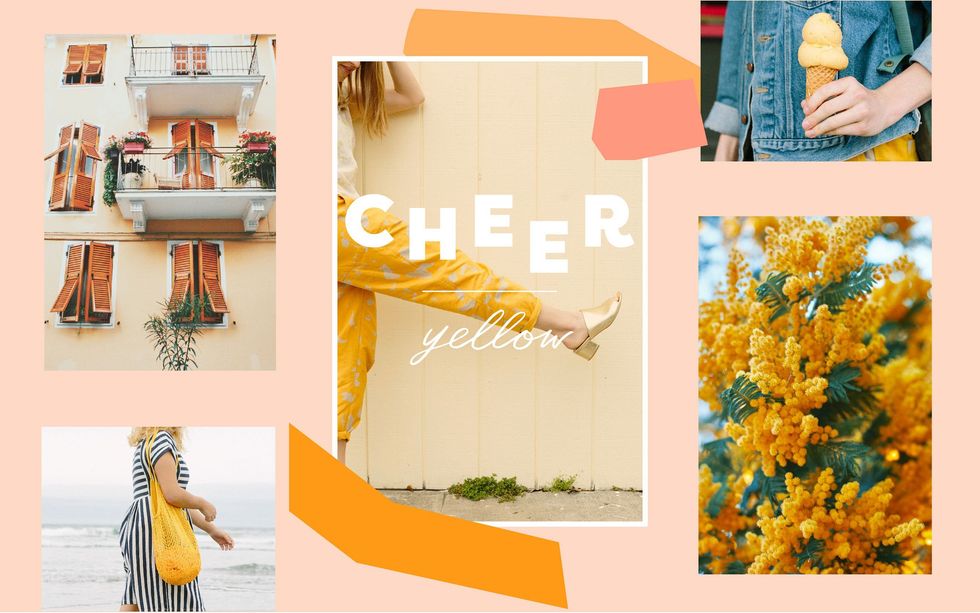
Yellow Color Psychology: Sparking visions of sunshine and summer, experts say yellow evokes optimism, warmth, creativity, energy, friendliness — collectively, what we’ll sum up as the word CHEER. The color makes you smile just picturing it, no?
We opted to use this cheerful hue in our kitchen, a space that houses daily hustle and bustle and is the heart of our home.
First, a sneak peek at our completed room…

Ta-da! Light, bright, and cheery all over.
So, let’s get to it!
Mood Board

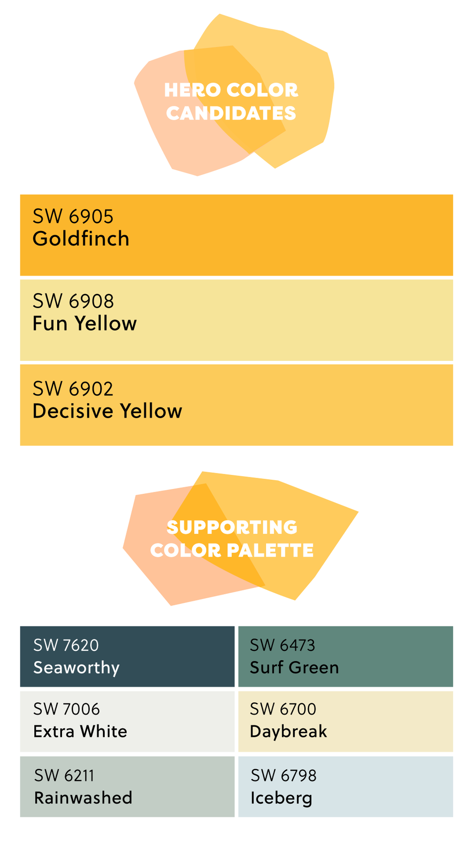
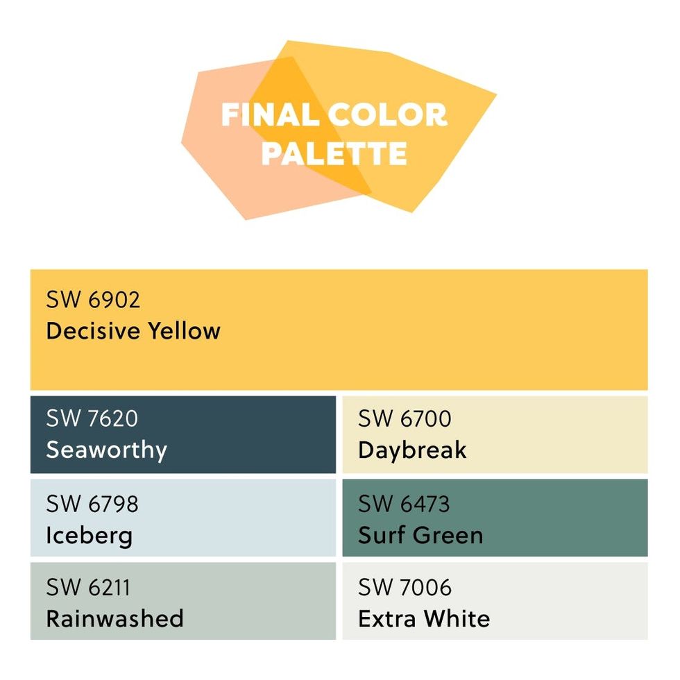
Voilà, our final color palette! She’s a beaut, isn’t she? See it come to life by watching the video below.
Transformation time! Painting with saturated colors is all about restraint — we wanted our kitchen to be playful *and* sophisticated but did not want the space to ultimately look like… a yellow submarine. So we opted to paint the kitchen island and base cabinets Decisive Yellow SW 6902 and leave the upper cabinets Extra White SW 7006. Painting the trim a navy Seaworthy SW 7620 helped us frame the room, letting our eyes relax a bit. Lemonade-like Daybreak SW 6700 also worked as a great accent color without stealing the show. (FYI: We used Sherwin-Williams® Emerald® Interior Paint on the walls and Sherwin-Williams® Emerald® Urethane Trim Enamel on the cabinets.)

It’s pretty rad to see our mood board come to life. You can spot our ultimate color combo in most of the pictures we took.
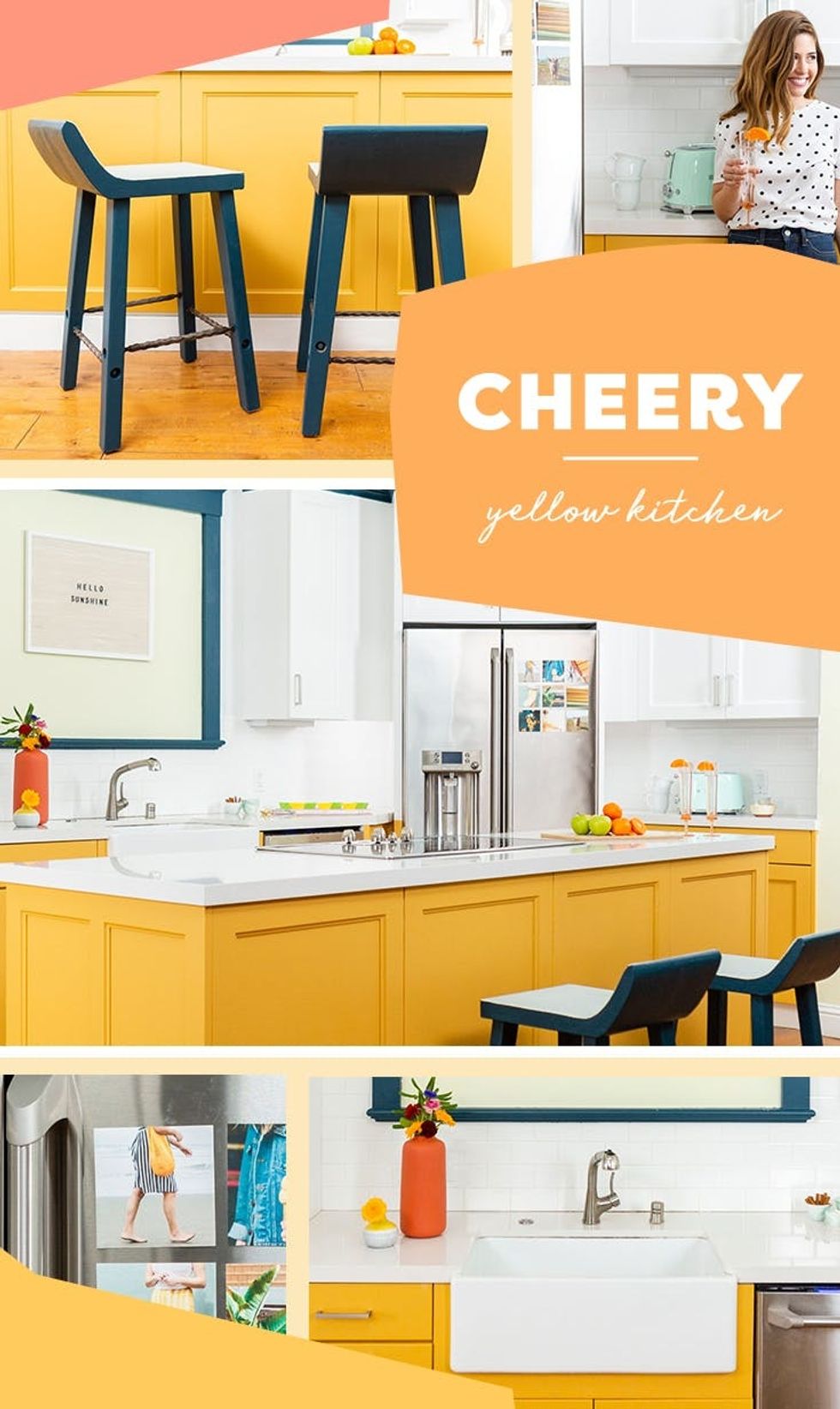
Ta-da! A cheery, warm, inviting yellow kitchen. We’re smitten.
For more color inspiration, check out our FRESH, CALM, and LUXURY color palettes too!

See? Once you know the basics of how colors can make you feel, you can use color psychology to make all the difference in your home. Thanks for following along!
Are you applying color psychology to your home decor? If so, we want to see the results! Share with us on Instagram by tagging @BritandCo so we can take a peek.
Author: Maddie Bachelder
Production: Kayla Haykin, Alonna Morrison, Maddie Bachelder
Design: Yising Chou + Torii Burnett
Photography: Brittany Griffin, Maddie Bachelder, Kurt Andre, Anjelika Temple
Video Production: Alonna Morrison, Kayla Haykin, Michael Sullivan, Ryan Shelley, Conor Hagen, Corey Marsau, Simon Lutrin
Models: Viktoriya Bourakova, Matilda Vertiz, Kayla Haykin, Torii Burnett, Natasha Thomas, Alonna Morrison, Julia Chaves, Maddie Bachelder
This post was paid for by Sherwin-Williams®
0 Commentaires