
Who doesn't want to live in a home that makes you feel like royalty? Choosing a color palette for your next interior design project is one of the best parts of redecorating. We love combing through color swatches and seeing how different hues make us feel, and if the goal is to feel like a princess, these 10 color palettes have you covered. The Roofing Megastore recently revealed the color palettes of some of the world's most beautiful castles and palaces, and we're living for it. In advance of Queen Elizabeth II celebrating her Platinum Jubilee, we're feeling particularly obsessed with all things royal, from traditional English recipes to these stately designs.
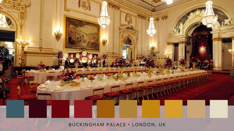
Buckingham Palace — London, UK
The official London home of the British royal family since 1837, Buckingham Palace is one of the most famous buildings of its kind in the world. With more than 50,000 visitors coming to the palace each year, it's a well-known mainstay of royal life.
The palace's color scheme is rich, warm and inviting, echoing the designs of the baroque and rococo periods. With shades ranging from burgundy to mustard to a muted grey-blue, the room is the epitome of upscale taste and class — but with a welcoming side.
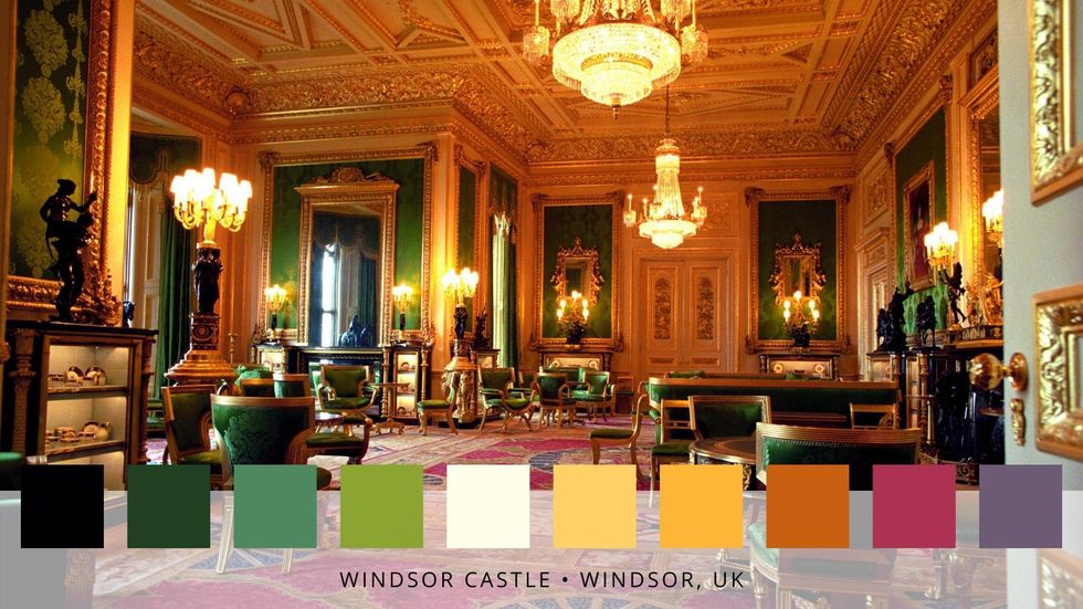
Windsor Castle — Windsor, UK
Windsor Castle brightens things up with shades of emerald green, pinks and purples, pops of orange, and tons of gold. Located just 20 miles from Buckingham Palace, it's another staple property of the British royal family (Prince Harry and Meghan's son Archie had his christening photos taken here). The color scheme is at once regal and eye-catching.
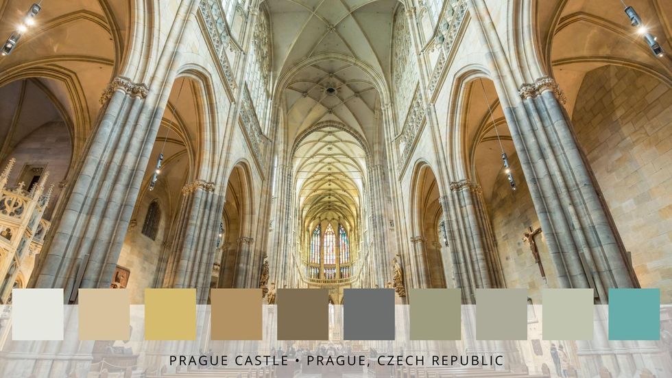
Prague Castle — Prague, Czech Republic
Prague has a reputation for being one of the most beautiful cities in the world, and Prague Castle is a perfect example of why it earns that reputation. The muted tones of the building evoke images of angels, art, and historic grandiosity all at once, with a range of neutrals that includes creams, greys, golds, and hints of blue.
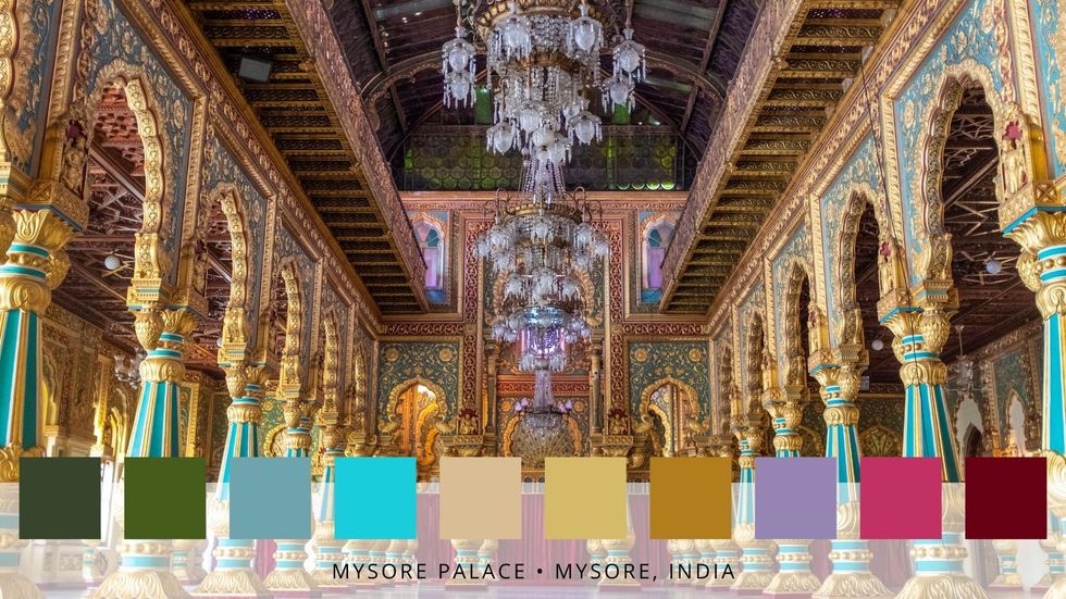
Mysore Palace — Mysore, India
Enveloping a vast 72 acres of space, Mysore Palace is India's second most-visited destination (surpassed only by the Taj Mahal, of course). Its stunning range of hues is exactly what you'd expect from a country as rich in beauty and color as India — turquoises, purples, burgundies, and emerald greens sit alongside golds and yellows, creating an aura of incredible drama and elegance.
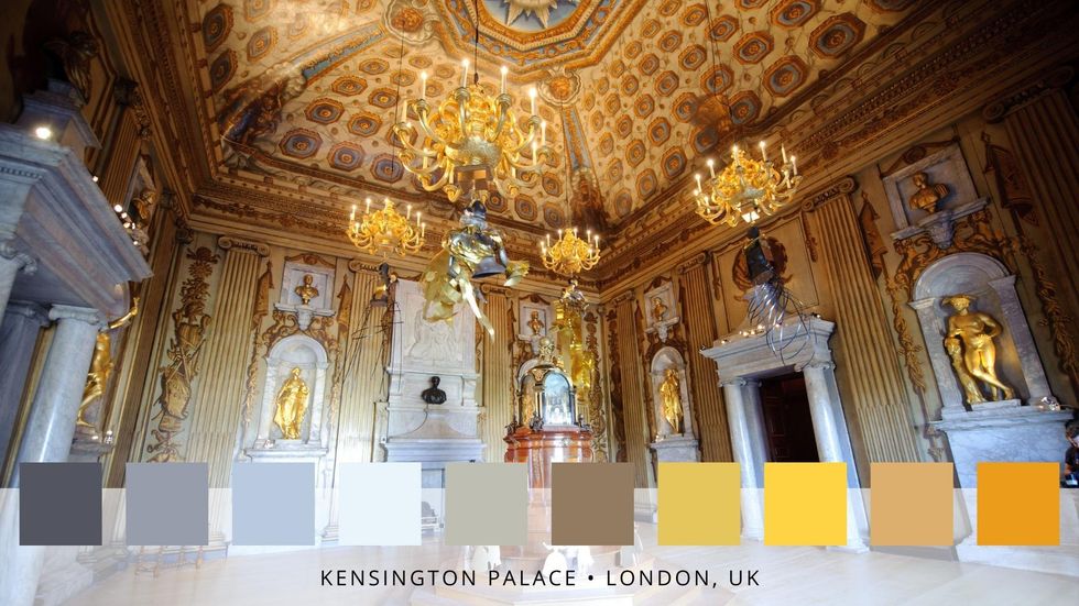
Kensington Palace — London, UK
Back in the UK, Kensington Palace — the spot that Prince William, Kate, and their children call home — is both grand and homey (if you're a royal, anyway). Princess Diana also lived here, possibly preferring the palace's more neutral palette to the other options in the royal property portfolio. Grey-blue and golds comprise the majority of the color scheme, with a few warm browns and neutral taupes thrown in. The result is regal, artful, and (dare we say it?) cozy.
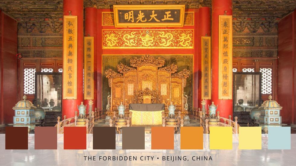
The Forbidden City — Beijing, China
The Chinese imperial palace between 1420 and 1912, The Forbidden City consists of 980 buildings (and you thought it was tough to decorate ONE!), more than 8,800 rooms, and 178 acres. The palace's color palette includes a range of stunning hues, including pale blue, muted mauves, rich reds, browns, and taupes, making it a truly unforgettable destination.
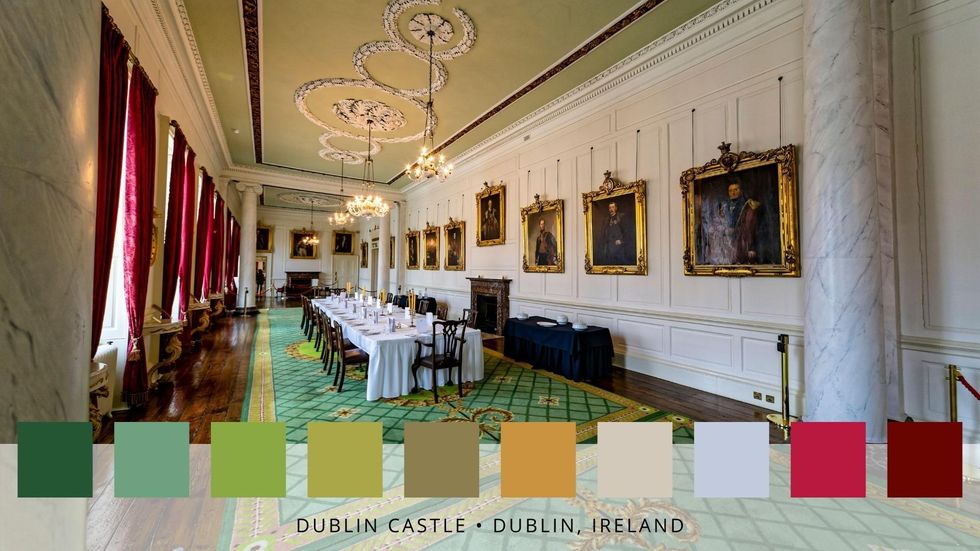
Dublin Castle — Dublin, Ireland
You'd be remiss to forget about the many castles that are spread across Ireland, just across the Irish sea from England and Wales. Dublin Castle in particular has a notable history and beauty, which is reflective of Ireland's grit and perseverance throughout conflicts with Vikings and the English. Build on a 13th century Viking settlement, the Palace was once the headquarters of England's ruling administration. In 1922, when Ireland earned its independence from Britain, the building was handed back over to the Irish.
The palette, as you might expect, is rich in shades of green, ranging from moss to kelly to emerald. It also boasts hints of red-pink, burgundy, and cream.
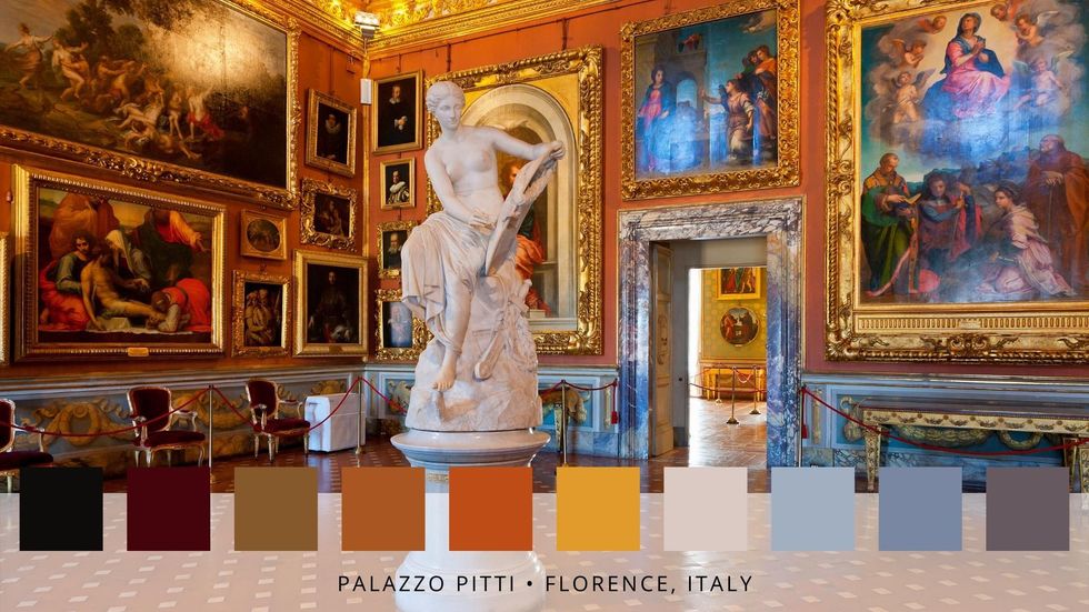
Palazzo Pitti — Florence, Italy
Let's head back to continental Europe, and to one of the most beautiful cities in the world: Florence. The Palazzo Pitti is home to world-renowned works of art, stunning architecture, and a rich history dating back to the Medici family's prominence during the Renaissance era. Its color scheme ranges from deep browns to pale blues, golds, reds, and everything in between, creating an opulent and uniquely Italian interior.
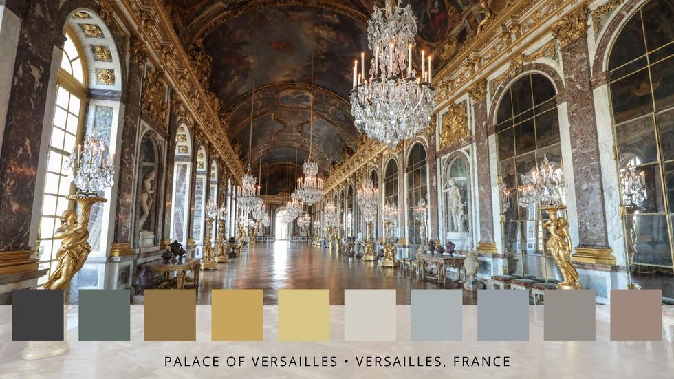
Palace of Versailles — Versailles, France
The opulence of the Palace of Versailles is not to be rivaled, and stands as a lasting example of French baroque architecture. As one of the most famous royal chateaus in France, the palace has played host to many a royal party or event over the years. With a color palette centered in differing shades and tones of grey and gold, it's equal parts elegant and extravagant.
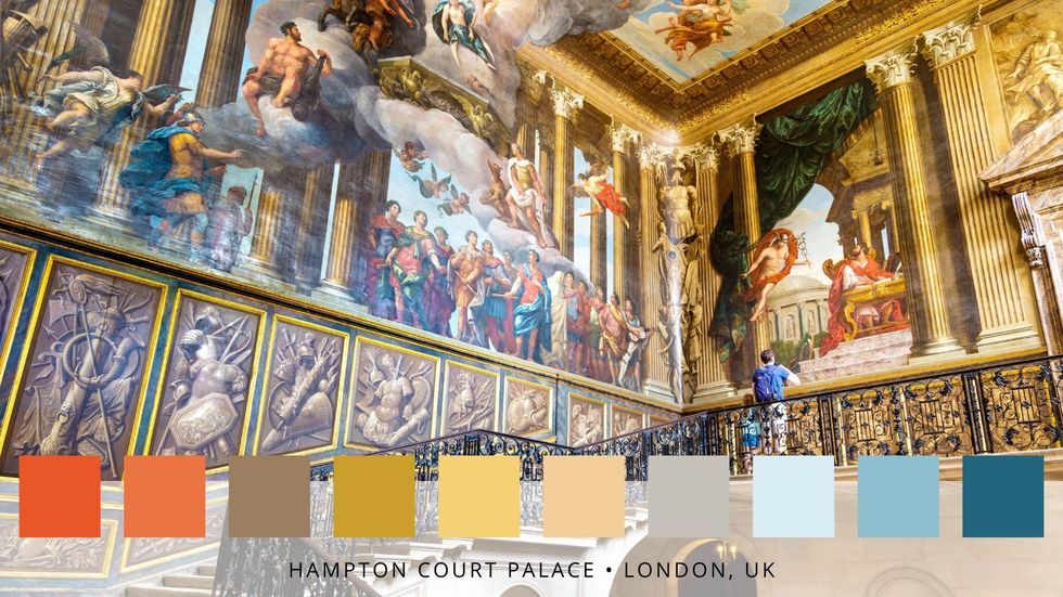
Hampton Court Palace — London, UK
We'll round out this journey to the world's most famous palaces back in the UK — and in fact, back in London. Hampton Court Palace is another baroque-era gem, and was the spot that King Henry VIII and his six wives (if you know, you know) called home. The palette is rich in color thanks to the abundance of art that fills the halls, and tones range from navy and sky blue to buttery yellow and vibrant orange.
Are you celebrating the Queen's Platinum Jubilee this weekend? Tweet us @BritandCo to share your plans with us, and don't forget to subscribe to our newsletter!
Featured photo via Pexels.


0 Commentaires