
We'll swoon over a good before-and-after redesign, and the designers behind L.A. design firm Hollis Jordyn Design didn’t disappoint on their latest project: a four-bedroom, four-bathroom home in Encino, California. Design principals Hollis LaPlante and Jordyn Grohl restored the 1959 home to its original mid-century glory. Check out the incredible transformation below!

The original home, the first one built in this SoCal neighborhood, felt like a 1960s time capsule. Think large tile retro flooring, wood paneling, and bright red carpeted floors.
“Our goals for the renovation were to revive the original mid-century style of the home in an updated, modern, and refreshing way,” says LaPlante.
Lesson #1: Wood warms up the place

That meant swapping out the retro tile for reclaimed wood flooring from Cliffside Royal Collection and adding in walnut beams and cabinetry to nod to a mid-century past (while still keeping it totally cool and modern).
"We incorporated wood beams in a walnut tone to bring in some warmth and enhance the natural palette," says Grohl.
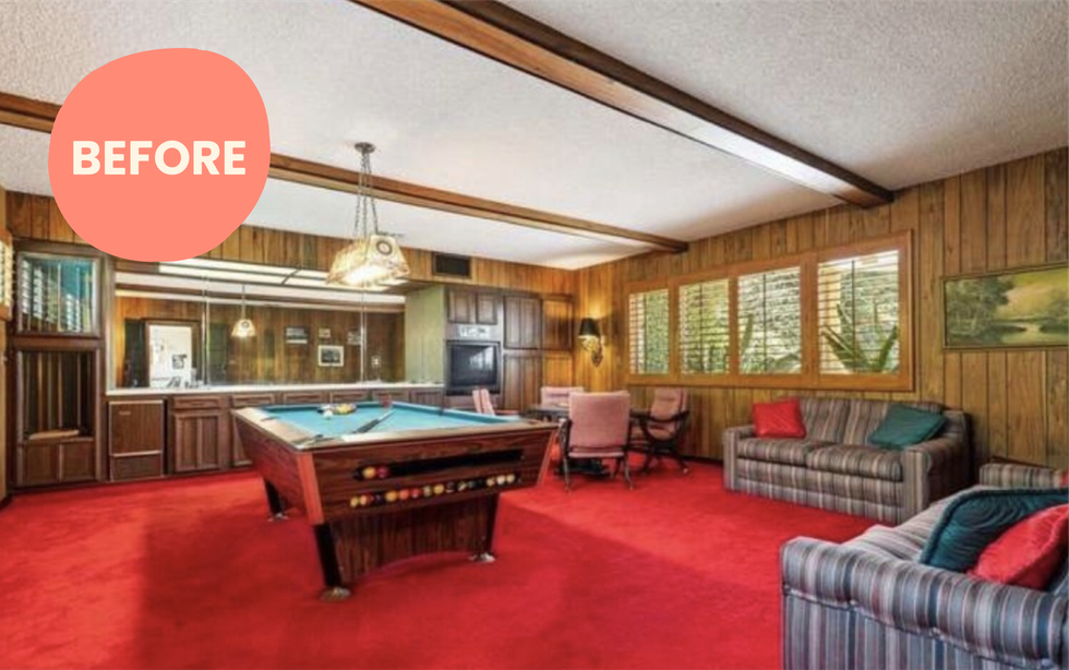
Topping the list of the homeowners’ must-haves included bringing in more light, creating an open floor plan, and incorporating vintage elements and accessories to make the home feel authentic and honor its past. Some vintage elements had to go though: so long red carpeting!
Lesson #2: Keep what you love, restore what you don't

While LaPlante and Grohl renovated the entire home, they kept a few original elements to honor the home’s original characteristics and charm. The media room’s built-in is original but they updated it with a beautiful blue paint.
“We kept the original hardware on the front door and on the cabinets leading into the media room too," says Grohl. They also kept the stone on the face of the living room fireplace intact.
Lesson #3: Bring the outdoors in whenever possible
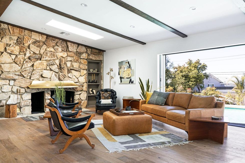
To bring in more light, LaPlante and Grohl tore down walls that originally created a barrier between the kitchen, dining room, and living room, to create an open floor plan and a functional sense of flow.
"Once we did that we were able to put in place an expansive slider to the outdoor space. This was a way to highlight the indoor/outdoor elements of the mid-century style, while enjoying the view of the pool and the valley," says LaPlante.
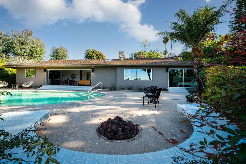
Outside, the 1960s kidney-style pool was in great shape, and the designers updated the landscape with low-water and drought-tolerant plants, giving the space a California-cool vibe.
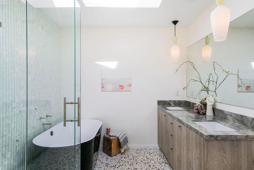
They also added skylights into the ceiling in order to create more light, which beautifully brightens up this refreshed bathroom.
Lesson #4: Curated vintage pieces give a space some soul
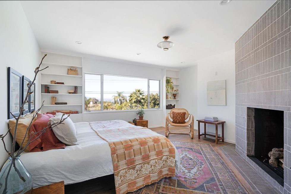
LaPlante and Grohl chose locally sourced decorative pieces that were vintage or vintage-inspired (Etsy was also a major lighting source) to bring more authenticity to the home.
“We kept all of the bedroom closets the same but replaced the hardware to fit the mood of each bedroom,” says LaPlante.
Lesson #5: A soothing color palette never goes out of style
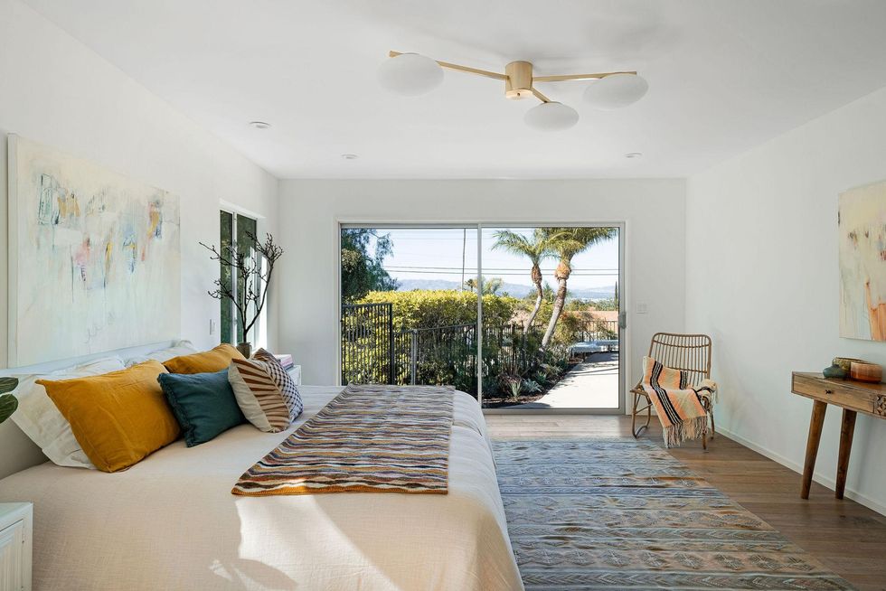
Natural-hued textiles liven up a white room to keep the balance fresh, relaxed, and soothing but not boring. "We really wanted to be sure to incorporate a color palette that is found in nature," says Grohl.
Lesson #6: Color and lighting can make a big impact
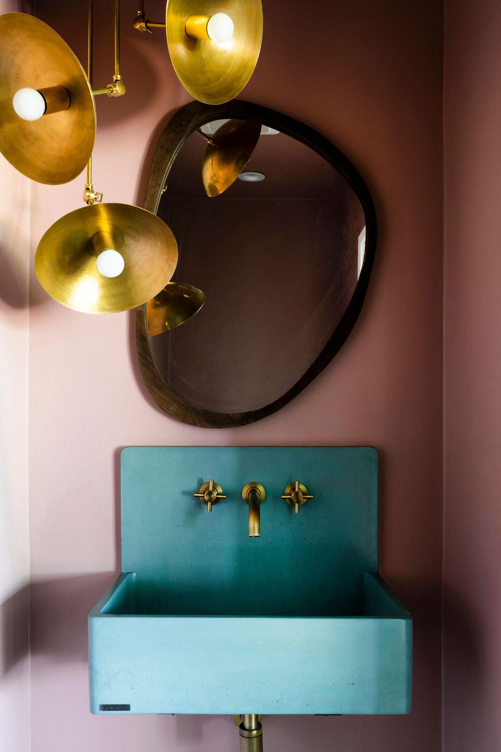
A retro brass light from Etsy paired with Benjamin Moore Sandblast paint echoes the classic retro pink bathroom in a totally elevated way.
"We wanted to create a moody powder room and thought the mauve paint tone really accentuated the teal and brass in a romantic way," adds Grohl.
Lesson #7: Mixing textures gives a room visual appeal
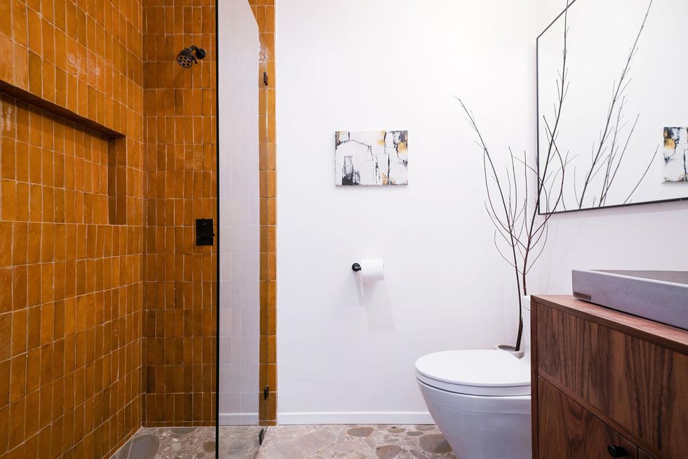
A stone floor paired with Zia handmade tile and wood cabinetry accentuate the natural elements of the home without any of them competing for attention.
"The transformation of this home was absolutely stunning and we couldn’t have been happier," says LaPlante. "We were thrilled that we were able to breathe new life into this property by adding light, creating an open flow, and incorporating earthy design elements to pay homage to the mid-century period, while updating it for today’s living."
Love learning more about interior design styles? Be sure to subscribe to our newsletter for more home decor inspo and ideas!
0 Commentaires